Development of SAPUI5 Custom Controls - Practical Examples

In a previous blog post, we showed what preparation is needed to create SAPUI5 custom controls and how they are then developed step by step>>.
The following article shows that completely new controls can be realised with simple HTML and CSS knowledge. We will show you exactly how this works with two examples from current client projects. The first development is an extension of an existing control. The second is a completely new development with its own renderer function.

Extension of a SAPUI5 Custom Control

The extension comes from a desktop application, which is not available for mobile devices. The design team in the project wanted a button that would display different colours and icons on mouse-over. On the left you can see an icon / button with a hook as an icon. If you hover over this icon with the mouse, it changes to a pencil icon.

SAPUI5 Custom Controls

In this example, it makes sense to extend an existing control. This means that the existing functionalities, such as properties, events or aggregations, can continue to be used as normal. We have decided to extend the control sap.ui.core.Icon, as the property for hoverColor is already available there. Thus, only an exchange of the icon had to be made.

The sap.ui.core.Icon already has the property “src” for specifying an icon. In our Custom Control we have created two new properties called “defaultSrc” and “hoverSrc”. As soon as the mouse event “onmouseover” is triggered, the value from the hoverSRC is written into the existing src. If the “onmouseout” is executed again afterwards, the defaultSRC is written to src. By using the already existing setSrc function from the source control, the rendering does not have to be adapted. Only the icon is exchanged in the background.

The execution of a setter function of a control always triggers the renderer function. Therefore, this does not have to be triggered here in the corresponding mouse events.

New Development of a Control

In another example, a certain chart was to be built that does not exist in the standard SAPUI5.

This chart always displays a value between 0 and 100, consists of a colour gradient in the bar, should display the Y-axis in steps of 20 and should be able to accept custom colours and X-axis labels.
Broken down into simple HTML, this is no great feat. It’s just a few labels, lines and a rectangle with a gradient. Therefore, the use of a chart framework (e.g. D3.js) was dispensed with here and this was developed as its a standalone Custom Control. The expected parameters were 5 different colours, as well as a value and an X-axis label:

  • colorBarRGB (The colour on which the transparent gradient is to be built)
  • colorBarAccentRGB (The colour to represent the top line on the bar)
  • colorNumberRGB (The colour in which the displayed number is to be displayed)
  • colorXAxisRGB (The colour in which the X-axis is to be displayed)
  • colorXAxisDescRGB (The colour in which the X-axis description is to be displayed)
  • value (The value on the basis of which the bar is built)
  • xAxisName (The X-axis label to be displayed)

The renderer function initially looks like this:

The transferred oRM stands for the SAPUI5 RenderManager. The oControl transferred is the custom control instance from which the properties can be read. First you start with a div, which is closed again at the end. The ControlData and CSS classes, which can be transferred via the XML, are written into the div itself. Within the two div tags, you can now write your own HTML, which will fill the Custom Control with life. This has been outsourced here into three separate methods. Within the methods, individual divs were again created, styles added and transferred back to the main renderer function at the end. In order not to have to perform cumbersome string concatenations, div objects are created in the three outsourced methods. These are converted by jQuery into an HTML string and thus transferred to the write function. Here you can see the function that is responsible for the background and the X and Y axes as an example.

Conclusion

In this blog post, two current customer examples were used to show that the development of Custom Controls does not have to involve an enormous amount of effort. Often these can be easily extended. New developments can also be realised quickly and conveniently with simple HTML and CSS knowledge – and without large budgets and long-term use of resources.

Written by Martika Möller

Share Post

More Exciting Topics from our Newsroom

Shortcuts for SAP BW in Eclipse

This blog post explains five simple shortcuts to make working...

Read More

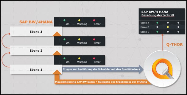
Data Quality in SAP BW: Checking Data for Plausibility without Programming

Our standard software Q-THOR can easily improve data quality in...

Read More

SAP HANA Transport with MS Azure Pipelines

This blog post introduces the transport tool MS Azure Pipelines...

Read More